Friday, August 30, 2013
Survey Says ...
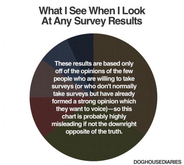
What if the pie chart used vibrant, pastel colors and had a 3D effect? I read somewhere that doing so improves the quality of polling data. Doghouse Diaries is being too skeptical.
More
No comments:
Post a Comment
‹
›
Home
View web version

No comments:
Post a Comment