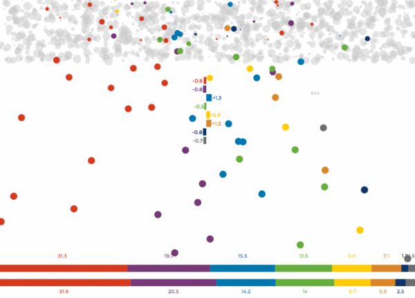
During
election season, we see poll after poll taken by various groups that
sometimes hit the mark, more or less, and sometimes are just plain
wrong. Maarten Lambrechts produced
an interactive graphic called Rock ’n Poll
that explains why polls don’t line up with real-world results. Click
the check button to advance the graphic. Through the simulation, we take
political preference polls in the fictional country of PollLand, which
has a million voting citizens, represented by a thousand dots, and eight
political parties, each represented by a bright color.
The
exercise illustrates the margin of error in imaginary polls in which
sampling is perfectly representative and everyone cooperates and tells
the truth. If errors creep into polls in PollLand, you can imagine how
hard it is to get correct results in the real world.

No comments:
Post a Comment