
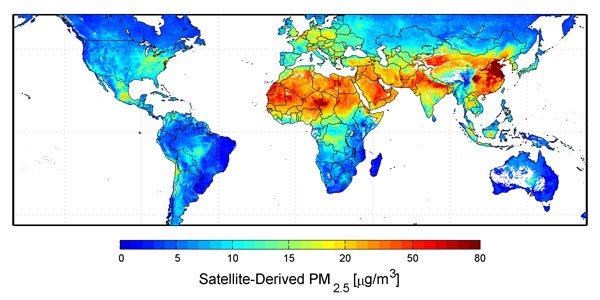
NASA's satellite-derived map of air pollution, throughout planet earth, between 2001-2006.
Specifically, the "warmer" areas of the color map (yellow, orange, red) indicate higher densities of problematic particles known as fine particulate matter, or PM2.5. These are 2.5 micrometers or less in diameter, roughly 1/10 the width of a strand of human hair. They're small enough to sneak past your body's defenses, and lodge inside your lungs.
No comments:
Post a Comment