
To Trap Shoppers ... Duh!
Why?
Elementary, my dear Watson: it’s so you shop more!
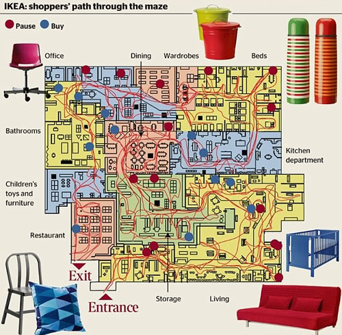
The home furnishing chain’s mazy layouts are a psychological weapon to part shoppers from their cash, an expert in store design claims. The theory is that while following a zig-zag trail between displays of minimalist Swedish furniture, a disorientated Ikea customer feels compelled to pick up a few extra impulse purchases.
According to Alan Penn, director of the Virtual Reality Centre for the Built Environment at University College London, Ikea’s strategy is similar to that of out-of-town retail parks – keep customers inside for as long as they can.
‘In Ikea’s case, you have to follow a set path past what is effectively their catalogue in physical form, with furniture placed in different settings which is meant to show you how adaptable it is,’ he said. ‘By the time you get to the warehouse where you can actually buy the stool or whatever’s caught your eye, you’re so impressed by how cheap it is that you end up getting it.’
No comments:
Post a Comment