An
interactive map by Andrew Kahn shows the origins and destinations of
ships that transported slaves from Africa to the New World (and some
other countries) between 1540 and 1860. Nothing much happens at first,
but soon the action becomes a flurry and then a flood.
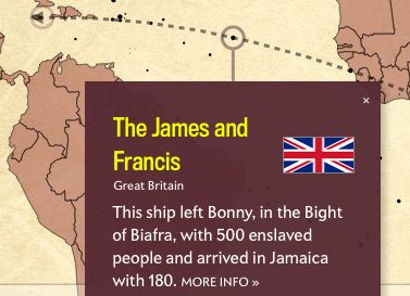 The
dots—which represent individual slave ships—also correspond to the size
of each voyage. The larger the dot, the more enslaved people on board.
And if you pause the map and click on a dot, you’ll learn about the
ship’s flag—was it British? Portuguese? French?—its origin point, its
destination, and its history in the slave trade. The interactive
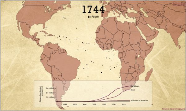
animates more than 20,000 voyages cataloged in the Trans-Atlantic Slave
Trade Database. (We excluded voyages for which there is incomplete or
vague information in the database.) The graph at the bottom accumulates
statistics based on the raw data used in the interactive and, again,
only represents a portion of the actual slave trade—about one-half of
the number of enslaved Africans who actually were transported away from
the continent.
The
dots—which represent individual slave ships—also correspond to the size
of each voyage. The larger the dot, the more enslaved people on board.
And if you pause the map and click on a dot, you’ll learn about the
ship’s flag—was it British? Portuguese? French?—its origin point, its
destination, and its history in the slave trade. The interactive
animates more than 20,000 voyages cataloged in the Trans-Atlantic Slave
Trade Database. (We excluded voyages for which there is incomplete or
vague information in the database.) The graph at the bottom accumulates
statistics based on the raw data used in the interactive and, again,
only represents a portion of the actual slave trade—about one-half of
the number of enslaved Africans who actually were transported away from
the continent.
If
you learned about slavery from American history classes and TV, you
might be surprised to see how many slave ships actually went to the U.S.
as compared to other destinations. The number of transports to America
is dwarfed by those sent to the Caribbean and to Brazil.
Watch the map in action at Slate.

No comments:
Post a Comment