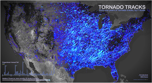
John Nelson—the data visualization designer responsible for that global map of earthquakes I posted last week—has also made a strangely beautiful map showing every tornado to hit the U.S. between 1950 and 2011.
Part of what makes this map interesting is that it shows not only the touchdown location, but also the path of the tornado as it moved. Better yet, Nelson has several other related maps that break the data down in different ways. For instance, if you look at the tornado map broken down by seasonality, you can see a really amazing pattern, where what constitutes "Tornado Alley" appears to move northward over the course of the year. In December, January, and February, the bulk of tornadoes have been centered on south and south-central states like Mississippi, Texas and Kentucky. In peak tornado season—March, April, and May—the southern states are still affected, but the reach of the tornadoes has extended north and west. By June, July, and August, most of the tornado activity is happening in states like Michigan and Minnesota.
Another interesting thing I spotted on these maps: There's a hole in tornado activity centered on West Virginia. All around the state, there's a history of tornadoes. In the Mountain State, though, the number of tornadoes drops off precipitously. I'm really curious what's causing that, or whether it's a flaw in the data.
Compare tornado habits throughout the seasons
Compare tornado numbers by F-scale
Compare tornado history before and after the historically devastating 2011 season.
Watch an animation of tornadoes by year

No comments:
Post a Comment